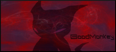
The 3rd one definitely.
The 1st one was good, but didn't have enough eyecandy for me. I like the dark scheme on it though.
The 2nd one almost got my vote, but didn't fill up the signature as much as I would have liked it too. Amazing nonetheless.
Now, the 3rd because fills the signature nicely, awesome color scheme, and perfect background. The sketchiness style, really polishes the signature.
Of course, these are just my opinions.