Original Post
Text Test
I want YOUR opinion on this text test.
I decided to mess around with text, and I want you to judge it.
1-10 + comments
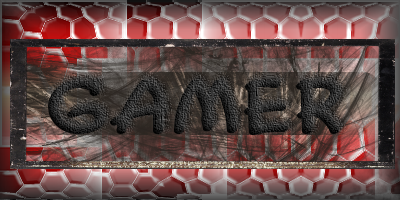
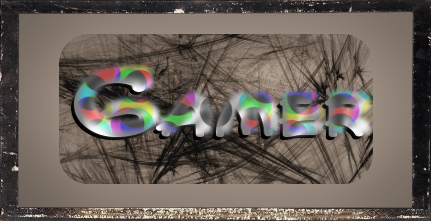
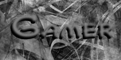

I decided to mess around with text, and I want you to judge it.
1-10 + comments


Last edited by gamer; Mar 19, 2008 at 01:11 PM.
Reason: ANOTHER!!!
God i almost sufficated after i gagged on the water i was drinking right when i saw this
MDP/Switch/Evan says (9:57 PM):
well, your "File" turned out to be a cuple of pics with a cock.
WindWakers Leader Gamers Signature On.Toribash
I added another.
Enjoy.
If you want one of your name, post please.
Enjoy.
If you want one of your name, post please.
God i almost sufficated after i gagged on the water i was drinking right when i saw this
MDP/Switch/Evan says (9:57 PM):
well, your "File" turned out to be a cuple of pics with a cock.
WindWakers Leader Gamers Signature On.Toribash
4/10[first one]
i dont like how all the colors clash with one another, sure red and black go, but how u havnt blended them, [if you have obviosuly it aint seeable] u need to do a lot of work and blending, may i suggest reading more tutorials?
and the second one i give a 5.5/10
i like how u dun the text, its got better then the first one, but u left all that grey space which just isnt needed and could have had a c4d-render more efects to it, also you kept with the same brushing behind the text, that reli needs to go =/
[sorry if that sounded harsh, but u asked for a coment, also if u want, u tell em wat type of tutorial you want and ill get u one, ive got a file with over 200 tutorials for text and sigs]


