The way you did shading on it made it look like cloth, try using sharper shadows if you know what I mean
I reckon it's in the first stages of completion. The black lines that outline emphasis are looking waaaay too much like a computed paint brush and the color scheme is a little off. Maybe just stick with the red white and black and scrap that strange purple?
Or stick with the contrast, it's your choice. I have no idea what you're thinking of doing with it!
for some reason to me it kind of looks like a robotic chicken I could just have a weird perception though, keep up the good work
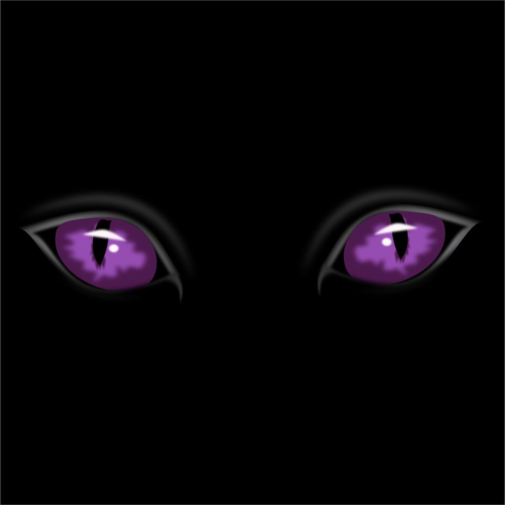
The eyes should be more like this but with the inside of the eyes glowing
Just a suggestion
It has a good thought, but the purple squares in the eye's aren't blended very well they look too blocky, and the purple on the side of the face looks really blurry imo.
eyes
your right