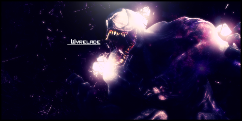
again, random glowy circles. the point of GFX is to make it seamless, so you don't know exactly how it's made but it still looks cool.
also, try a 1 pixel border, they're less ugly
the parts on the left are very blank, nothing is really happening in this and it's very dark
also, try a 1 pixel border, they're less ugly
the parts on the left are very blank, nothing is really happening in this and it's very dark
pennis and also dicke and balls
you should make a gun pointed at him to make it look like he's being shot were the glow spots are. make it look cooler and fix the glow so it will look like the gun flash if you decide to do it.
Go get a life and you'll notice there is no point in anything. This "style" can be good in the right hands. But this is just horrible. There is nothing in the sig connecting to the theme "Venom". Thus you fail yet again.
Jalis: Freelancer, you're a duck | Sachi: Freelancer, you're a duck | Reanimator: Freelancer, you're a duck
satiknee: Freelancer, you're a duck | Wiggi: Freelancer, you're a duck | Tarlan: Freelancer, you're a duck
satiknee: Freelancer, you're a duck | Wiggi: Freelancer, you're a duck | Tarlan: Freelancer, you're a duck


