It's a very cute way of mapping it. Lizard heads go! I've never really seen that kind of mapping, but it's looking good. As always, vector feels clean. The only issue I have is that the bottom area is looking empty.
My own work:

My own work:

|Cube | Sphere | Cylinder | Torus|
Youtube channel for the shits and giggles
Youtube channel for the shits and giggles
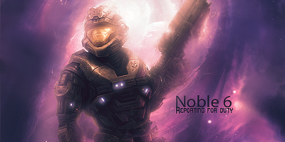
I likes, although... you could blur a litle the left arm and the bottom of the torso, else it's too outstanding and my eyes are confused where to actually lookand maybe add some dodge/burn effects on the visor and the under part of the helmet
I'm Tasty and I know it.
I like Rocks.
I like Rocks.
Doxxy, makes me want to play skyrim. Fix the mouth to make it more mouth like. the black line isn't expressing it well.
Raid your text always stands out too much for me. Any way you can blend it a bit?
Raid your text always stands out too much for me. Any way you can blend it a bit?
My heart just wouldn't be in it, you know? haven't got one.


