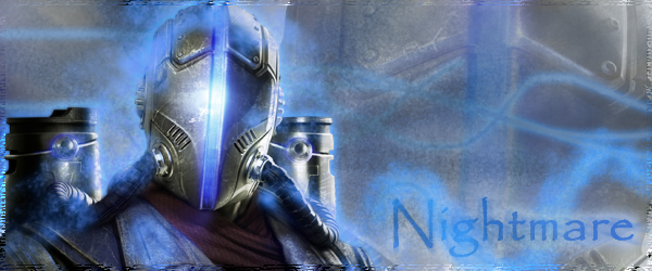
These sigs show a complete lack of any flow or unifying theme (besides color). While the focal looks nice, it takes up way too much of the frame, and the sig as a whole suffers for it. Your background are very basic and boring, and your text is huge and takes away attention from the focal. Try working in a smaller image size and place the focal away from the center, especially in the third sig (it leaves too much empty space under the arm).
Here are some sigs that I made when I was a beginner that show what I mean by background blending and subtlety of the focal (while keeping it the center of attention)- http://fc09.deviantart.net/fs71/f/20...y_Oysteria.png
http://fc09.deviantart.net/fs70/f/20...y_Oysteria.png
Ignore the text, it's somewhat shoddy.
Keep in mind that photoshop should be used not as a medium to show off your l337 pentool sk1ll5, but to enhance the viewer's focus on whatever render or stock (focal) you're using. Right now your sigs are a mess of lines and broken renders/brushes, but if you use it to augment (rather than distract from) the focal, you can start to call your work GFX.
back from the dead


