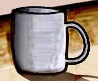
stuff and things have a fairly constant colour, but light is directional, it hits things and creates highlights and shadows and stuff.
once you get your head around that affects your drawing it gets much easier, technique and stuff just takes practise.
keep practicing and you'll see the improvements
once you get your head around that affects your drawing it gets much easier, technique and stuff just takes practise.
keep practicing and you'll see the improvements
-=Art is never finished, only abandoned=-
Why is everyone bashing this guy so hard? nobody said you had to be Mozart on your first attempt. Encourage him into the world of drawing, dont make him regret posting on a board where everyone is expected to be good. Pretty positive he posted here just to get input from the great people of Art.
ow
I was going to post yesterday
Well,
The idea of posting stuff online is to get CNC about how can you improve and get feedback from other people about your progress whether is good or bad. Telling the guy that his stuff is bad and he shouldn't post unless is not good doesn't help him out in any good way. Before trying to explain him what he did wrong with Google images without any clue on what to do next, explaining to him that there's more to shading and the fundamentals he needs the Google image doesn't really explain.
Perspective (Casting shadows and perspective)
There's different points of perspective so you can research them a little :)
https://www.youtube.com/watch?v=8XLgmiExAbw
Proportion(For your proportions/figures)
https://www.youtube.com/watch?v=luJh1ASyzB8
Light & Shadows
https://www.youtube.com/watch?v=0q-LZVFZuGE
Colors and value (This will help you understand more the shading)
https://www.youtube.com/watch?v=g2fZdGZKP1k
The method he choose to learn on how to draw doesn't really matter, either way he's learning and there's nothing to lose since he bought a tablet for that purpose.
Still, some traditional sketching might help you out so you can go and buy a sketchbook and practice when you don't have access to your computer.
Aren't we misdirecting frustration to this guy stuff ;>
He's starting out, the most he need right now is encouragement and help on how he can improve hi artwork.
"LEARN TO DRAW FIRST" SMH
Hang in there,
ME.
excuse english
I was going to post yesterday
Well,
The idea of posting stuff online is to get CNC about how can you improve and get feedback from other people about your progress whether is good or bad. Telling the guy that his stuff is bad and he shouldn't post unless is not good doesn't help him out in any good way. Before trying to explain him what he did wrong with Google images without any clue on what to do next, explaining to him that there's more to shading and the fundamentals he needs the Google image doesn't really explain.
Perspective (Casting shadows and perspective)
There's different points of perspective so you can research them a little :)
https://www.youtube.com/watch?v=8XLgmiExAbw
Proportion(For your proportions/figures)
https://www.youtube.com/watch?v=luJh1ASyzB8
Light & Shadows
https://www.youtube.com/watch?v=0q-LZVFZuGE
Colors and value (This will help you understand more the shading)
https://www.youtube.com/watch?v=g2fZdGZKP1k
The method he choose to learn on how to draw doesn't really matter, either way he's learning and there's nothing to lose since he bought a tablet for that purpose.
Still, some traditional sketching might help you out so you can go and buy a sketchbook and practice when you don't have access to your computer.
Aren't we misdirecting frustration to this guy stuff ;>
He's starting out, the most he need right now is encouragement and help on how he can improve hi artwork.
Hang in there,
ME.
excuse english
Last edited by Neru; Jul 7, 2014 at 02:56 AM.
⋐⋑
<ishi> 2MEGPOID4ME
<ishi> 2MEGPOID4ME
Drawing things that have volume, mass, cast shadow and 'exist' in 3D space (perspective) is like working in some 3D program, but instead of the coded piece of software only thing you have is your brain.
You have to look at the objects and transfer them from 3D space to 2D space using lines and shades of gray (for the start).
On regular art classes pupils start by drawing things that represent basic geometric figures: ball, cylinder, box... And add stuff to their drawings as they progress, first basic lines, then shading, then perspective... Then all together, tones, etc...
You are in the beginning of your road. First step out of many, many, many more... (lol I sound like that guy from Police Academy).
Django: You can clean up the mess, but don't touch my coffin.
thank bro appreciate your help and signature
-----
@Mozebra
Criticism is a way of succeeding
i did not fail 2 times
I learned from my mistakes now im learning
BTW
Thank you all for the help i really like
thanks for the criticisms and Pros and Cons Love Y'all
-----
@Mozebra
Criticism is a way of succeeding
i did not fail 2 times
I learned from my mistakes now im learning
BTW
Thank you all for the help i really like
thanks for the criticisms and Pros and Cons Love Y'all
Last edited by SKITZOFRENIK; Jul 7, 2014 at 06:12 PM.
Reason: <24 hour edit/bump
I'm a wordsmith cursed with verses and the worst shit.
A vile winged wicked bird who no one lurks with.
A vile winged wicked bird who no one lurks with.


