Dover:
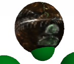
Not bad, not bad. I like where the eyes are going.
Keep working on it and you may actually succeed
Corza:
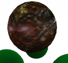
Wow, i really like the spines. The mouth is a bit indifferent, and a lot of blank space.
Keep working on this too!
=D
Not bad, not bad. I like where the eyes are going.
Keep working on it and you may actually succeed
Corza:
Wow, i really like the spines. The mouth is a bit indifferent, and a lot of blank space.
Keep working on this too!
=D
Last edited by Monobi; Apr 27, 2009 at 01:29 PM.
"Anything running perfectly is running like clockwork."
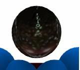
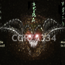
Wow! Corza thats nice! 
I'm suprised I haven't seen your work around before....

I'm suprised I haven't seen your work around before....





 j
j