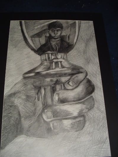
pretty good, some skill right there. what program did you use ?
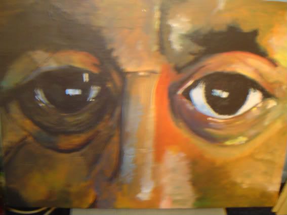
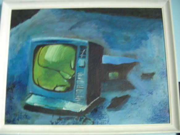
also aside from the skill level i dont like it for the fact that gold and red +green do not go well together
one of the most basic things you learn about in any art class is corresponding colors, and the color wheel, some colors work well with others, some really do not there are some exceptions, but something like this the colors make it look of poor quality
instead of having the diverse impact on the person looking at the work of art.
like for example some works of art are very plain and do not have a lot of detail but its the use of colors that make it art


