Original Post
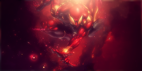
[Art] new siggiez.
yep. Another one for this week.
Another time trying new styles. Check these 2 siggies I made for examples about my new style.


No light BALL'z as you wanted it to be.
Another time trying new styles. Check these 2 siggies I made for examples about my new style.


No light BALL'z as you wanted it to be.
"B U R A K K U W A I T O A A M A A"
- B l a c k | W h i t e | A r m o r -
- B l a c k | W h i t e | A r m o r -
The style is neat, but you are lacking a few things. Depth, blending and color variation.
To me these 5 things are important.
For example of all 3 in the second one. The colors are just taken from the render and spread out without any new colors being introduced. There isn't much blending on the render to make it fall or meld into the back ground, and there is no real depth. It just goes from the back ground to the render. Though i can kinda see how you tried to create depth by darkening and blurring some of the splatters in the bg.
The style is neat, but you focus too much on the bg. Also, your lighting is a bit strong, you should tone it down and try adding a few gradient overlays using differently colors to create you global lighting effect. Then all you need to do is use the dodge/burn tool to edit your render in the bg to fix the lighting.
As for blending and depth. It really comes with practice and trying new things. Don't be afraid to try blurring parts of your render slightly to create depth of field (which is my favorite type of depth), or darkening certain parts and making others brighter. Depth is not really about being subtle to me.
And try overlaying parts of your bg onto your render and taking things from the render it's self and fusing it with the back ground to blender it more. Not saying it should be infused with the bg, but it helps to see elements from the render in the bg and vise versa.
Good job overall, hope these tips help because you're getting better.
Aka jusmi.
«
Previous Thread
|
Next Thread
»


