Original Post
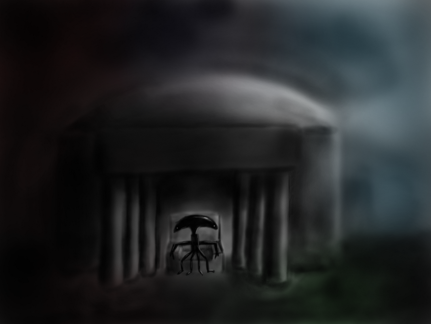
[IMG]Alien Memorial
So, I made this a bit brighter than usual. Based of the Lincoln Memorial, but with an alien, yay.


i have a totally post modern tattoo of a scalene triangle.
<DeadorK> fair maiden<DeadorK> if the cum is going to be in your mouth
<DeadorK> it shall be in mine as well
Well, MUCH better than the train :]
The alien is well detailed, but the rest is far too blurry to match. I really think you should consider using a smaller canvas and drawing with fewer pixels. Looks like you are airbrushing the shadows, and it looks inconsistent. Like along some columns, from top to bottom, the darkness wavers. Add sharper edges to everything.
Also, use foreshortening on the alien's left arm, our right. Actually the other one too. Since it should be pointed a bit more towards the viewer, it would appear shorter and also thicker at the ends. As is, pointing down and as thin as everything else, it looks like just that, pointing down. This contradicts the angle of the chair.
....
You might want to do some reading on perspective in art too.
But spiffy alien at least.
Well, MUCH better than the train :]
The alien is well detailed, but the rest is far too blurry to match. I really think you should consider using a smaller canvas and drawing with fewer pixels. Looks like you are airbrushing the shadows, and it looks inconsistent. Like along some columns, from top to bottom, the darkness wavers. Add sharper edges to everything.
Also, use foreshortening on the alien's left arm, our right. Actually the other one too. Since it should be pointed a bit more towards the viewer, it would appear shorter and also thicker at the ends. As is, pointing down and as thin as everything else, it looks like just that, pointing down. This contradicts the angle of the chair.
....
You might want to do some reading on perspective in art too.
But spiffy alien at least.
The shadows are like that on purpose. It would have been much easier to just gradient them and get a perfect consistency, but I didn't want that.
Also, the arms are just that shape, but I see how it can look as though they are just pointing down.
i have a totally post modern tattoo of a scalene triangle.
<DeadorK> fair maiden<DeadorK> if the cum is going to be in your mouth
<DeadorK> it shall be in mine as well


