Original Post
[WIP] Some sort of robotic head
I'll make this simple.
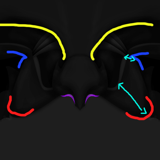
I haven't made a robotic head or anything robotic in absolutely ages and I know nothing about it but I decided to make a head, I just need some robotic head advice. Here is the WIP:

CnC please.
I haven't made a robotic head or anything robotic in absolutely ages and I know nothing about it but I decided to make a head, I just need some robotic head advice. Here is the WIP:

CnC please.
Tint is sex.
I don't know how it looks ingame, but the flat looks much too dark. Brighten it up a bit.
The eyes are a tad low.
Top mapping may be off.
Other than that, it's fine. I like some of the shapes you used.
The eyes are a tad low.
Top mapping may be off.
Other than that, it's fine. I like some of the shapes you used.
I'm not so sure as to what it is right now, but it looks like cat-woman. ;o
I like the way you added darkness into this head, but it looks strange how you added random pieces of opacity on the sides of the head. I also don't understand the artistry behind the "glowy" parts on the curved lines near the bottom sides of the head.
Other than that, this head looks like it has potential.
7/10
BAD LUCK
Yeah thats a pretty sexy flat looking flat and yeah i think that It could be brighter but it might ruin the coloring if its brightened to much so maybe just a tad bit so you can better see the details. Love the mapping the round parts look round and the flat parts look flat looks good so far.
7/10 also
7/10 also
<Swyne> <3 Fleip
<3 SWYIE
<3 SWYIE
veeery dark dont you think?
not much of a fan of the design.
your use of sharp angles, straight lines and round edges, and thick areas and thin areas doesnt really work for me
its like people saying talking about flow in sigs.
the area below the yellow/above the blue works pretty well, but the rest just isnt kicking it.
lines need to compliment each other, match curves, perpendicular lines etc etc

-=Art is never finished, only abandoned=-


