Original Post
[Tex] Dragon Helm Bro
Sketch
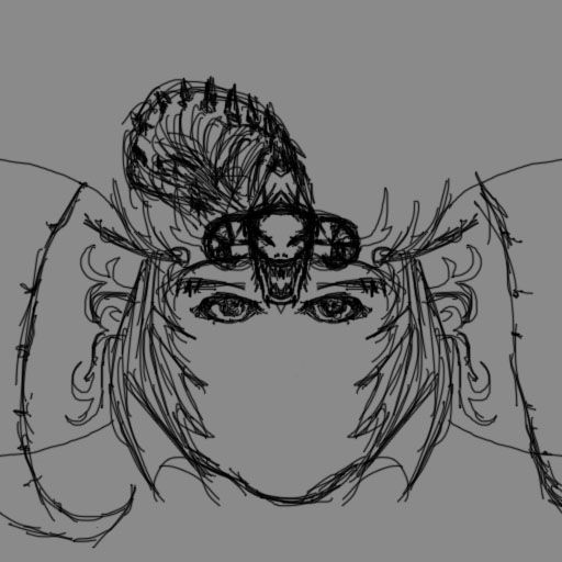
A sketch I made for Chaco's request. CnC what to add/change/w.e. lol thanks

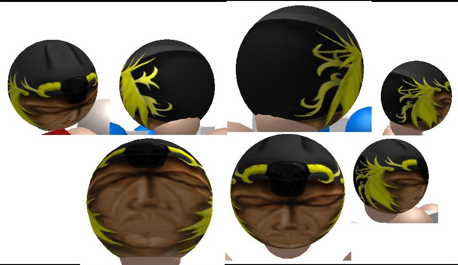
update *
Still a lot to do:
fix eyes (they're gross I know)
add a mouth and a nose
not really sure what to do with the dragon atm...
WIP
Last edited by joshyjojo; May 27, 2012 at 06:35 PM.
Wanna play some [CHESS]? <3
well,
the sketch is pretty messed up,
but I can see what you are meant to do.
it is a nice mapping of the eyes,
and is acceptable for far apart.
the eyes are a way wide, try to make it with less width.
if it is just a guy with helmet,
put many effort as possible on the face and helmet.
can be a pretty simple head, with complex details
Last edited by dengue; May 26, 2012 at 07:30 AM.
Wow joshy, nice sketch you've got here.
I would suggest maybe adding a few scratches to his face.
Try messing with one of the eyes, like he was injured in a battle.
I think this head has a lot of potential, and I would like to see it completed.
Looks a bit too symmetrical at the moment, but I'm sure you'll find ways to make it have the perfect balance of asymmetrical and symmetrical appearance.
8.5/10
Nice work.
[SIGPIC][/SIGPIC]
[SmallBowl] [fallu] [Moop] [Parrot] [SkulFuk] [Icky] [Sassy]
[Ex-MSquad] Need help with any market related questions? Feel free to PM ME. <Powas> I've got a degree in 1001 techniques of masturbation
[SmallBowl] [fallu] [Moop] [Parrot] [SkulFuk] [Icky] [Sassy]
[Ex-MSquad] Need help with any market related questions? Feel free to PM ME. <Powas> I've got a degree in 1001 techniques of masturbation
One of your best sketches I have seen so far :o
And sketches are named like that for a reason. They simply have to be messy in most of the cases
Anyways, it looks awesome but I have a feeling like the eyes might be a bit separated on a sphere. Have you tried it on a tori yet?
Also, you should totally edit the hair so it doesn't look too mirrored, etc.
Other than that, great work! I'm looking forward to see the result :>
And sketches are named like that for a reason. They simply have to be messy in most of the cases

Anyways, it looks awesome but I have a feeling like the eyes might be a bit separated on a sphere. Have you tried it on a tori yet?
Also, you should totally edit the hair so it doesn't look too mirrored, etc.
Other than that, great work! I'm looking forward to see the result :>
art board mods: if they dont understand it its not cnc
sketch is too detailed. you should simplify your sketches to just simple, clean strokes, don't shade, don't add detail, nothing. just the bigger outlines, you add details when you paint. it comes more naturally and works better.
I'm Tasty and I know it.
I like Rocks.
I like Rocks.


