Original Post
[Art] The GFX Bandwagon
/Bandwagon /Bandwagon


C&C go.


C&C go.
|Cube | Sphere | Cylinder | Torus|
Youtube channel for the shits and giggles
Youtube channel for the shits and giggles
Oh, didn't see this last time through the art board.
1. Looks great. Text is a tad distracting but not enough to make it terrible. Maybe a couple subtle effects would help, but I see what you were going for.
2. I really like how this one came out. The red and bluish lines are a nice touch. Mind posting the render for this one? :3
3. You did a great job at depth. I'm not so much a fan of the colors. Seems like you could have blended it all together a bit better.
4. Seems alright. The lighting could be worked on a bit. Flow and depth are okay. [ran out of time I have to go]
Thanks for the C&C. I'm sorry but I lost the joker render. I found it in the signature labs, I'm pretty sure you know what i'm talking about.

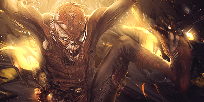
New one~

New one~
|Cube | Sphere | Cylinder | Torus|
Youtube channel for the shits and giggles
Youtube channel for the shits and giggles


