Original Post
[GFX]Sig Expedition
Hey ,everyone I'm back with my activeness on tb ._. anyways I'm in the mood to make Tc ,but in order for me to do that I need Cnc from you guys. I'd like you to take it seriously ,but relax lounge and Cnc TY

rawr original

Dead pool give chess a heads up


As you can see two of my sigs use similar styles , Idk ,but I've come to liking for this style and I'm not sure how good of and idea it is.

rawr original
Stock photo

Dead pool give chess a heads up
Stock photo

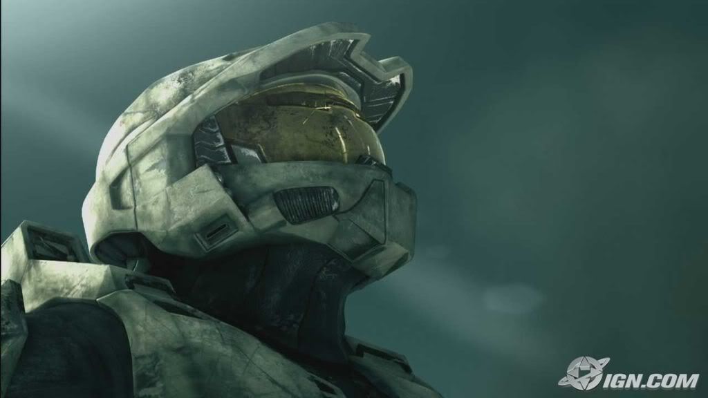
2 stock photos for this one

As you can see two of my sigs use similar styles , Idk ,but I've come to liking for this style and I'm not sure how good of and idea it is.
Toribash Senior |Wushu Master| YouTube Dancer |Video Editor| Senior Gfx artist| Univ of Penn Alumni|#Ivyleague
Each one is progressively better. I don't really like the first one, seems rather boring and dull.
Deadpool doesn't have that problem, only problems are the fact that you have a ridiculous amount of lighting with no legit light source(everything is glowing for whatever reason), lacks depth and doesn't blend well.
The only problem I see in the 3rd one is how the smudge is completely obvious. If it was your intention to make it smokey, duplicate the smudged layer, lower the first layer's fill a bit, and on the duplicated layer, Filter-> Distort-> Ripple(set to 500%) and try setting it to soft light/play with the opacity.
I love the depth in the last one, one of the few sigs I've seen with a properly used c4d. Love it. It bothers me that it has dual lighting, but, its still impressive.
respective ratings:
6/10
6/10
8/10
9/10
Hoss.
I indeed love your cnc skillz hyde. Yes, the first one I kinda played around with it ,but my main focus was to emphasize the dead space head in a foggy way.Kinda like thoughts or a dream.
2nd :Awww,I very well understand what you mean.I was trying to keep deadpool's detail in content so I figured instead of mirroring both sides & Using dark tone.I'd
3rd one : Hahah yeah ,I was creating a foggy clouds with out rending the clouds into the pic. I see what you mean and ty for the Tip right there. That's for photoshop cs6 and and illustrator right . Anyways,Heh The last sig is my newer sig I used a good amount of c4d's but kept them in retrospec.Lol about the dual lighting I actually
made everything darker except for the parts that light was needed. Ty for the ratings.
Toribash Senior |Wushu Master| YouTube Dancer |Video Editor| Senior Gfx artist| Univ of Penn Alumni|#Ivyleague
The first one is too bright. Pretty boring overall. The 2nd one could be pretty great with a bit more blending, I may mess around with it a bit. The one with the planet could use a couple well placed effects to get the flow going. The last one needs a slight cropping. Too much dead space (too bad this isn't the Dead Space sig because that would have been an amazing pun) on the sides.
Edit: Yeah, the deadpool one is a lot better with some blending.

Adjustment layers I added:
Violet, orange on linear dodge at 25% opacity.
Black, white on multiply at 10% opacity.
Customized red, white on soft light at 15% opacity.
Default warming photo filter.
Added some darkness around the edges and added a tiny bit to the light source. I also did some slight sharpening and blurring.
Edit: Yeah, the deadpool one is a lot better with some blending.

Adjustment layers I added:
Violet, orange on linear dodge at 25% opacity.
Black, white on multiply at 10% opacity.
Customized red, white on soft light at 15% opacity.
Default warming photo filter.
Added some darkness around the edges and added a tiny bit to the light source. I also did some slight sharpening and blurring.
Last edited by LWafflez; Aug 30, 2012 at 03:29 AM.
Applied for the Gfxi Organization wish me luck , anyways New Updates Cnc plz

I bet none of you young folks know of rocket man!!!!!!


I bet none of you young folks know of rocket man!!!!!!

Stock-image or just image lol
Toribash Senior |Wushu Master| YouTube Dancer |Video Editor| Senior Gfx artist| Univ of Penn Alumni|#Ivyleague


 New favorite Plz Cnc ty
