Original Post
[Tex] Revitalizing a Classic
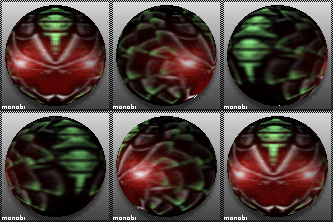
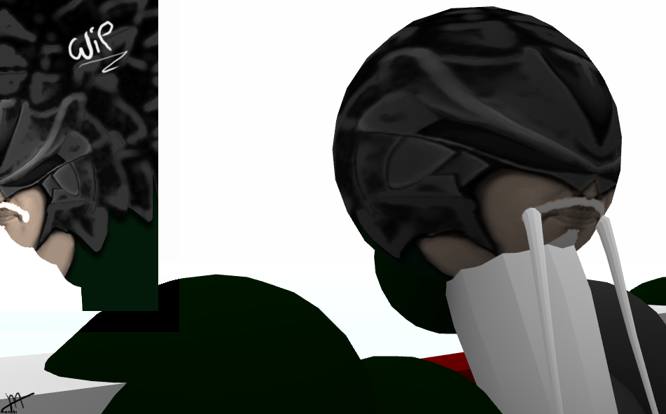
So I've decided to revitalize my original head texture to 512x512 from 128x128, add in some space for the fung fu beard and in general rework most of the shading.
A bit early for CnC, but has anyone any ideas that may be useful for this renovation?
The Original:


WIP 1
A bit early for CnC, but has anyone any ideas that may be useful for this renovation?
"Anything running perfectly is running like clockwork."
Use the burn tool at size 1.0 to make whiskers for the facial hair and then use the smudge tool on it to make it look more realistic. The lips are kind of a dull color, my suggestion is simply use the free select tool to select it and then make it a bit more saturated (Whatever makes it look more lush.). Adding wrinkles would also help, though I don't know if you're going for the old man look or not. BTW what program did you use to make this?
"I have no fear, for fear is the little death that kills me over and over. Without fear, I die but once."
Hello,
Looking great so far and I'm assuming your gonna add glowing effects after your done with the base of it. Also I hope you don't mind but this is great because I'm making a head texture for myself at the moment and it will be worn with my beard, imma steal your mapping cause it saves a lot of hard work.
Cheers

Cheap ass steam games,https://www.g2a.com/r/samuel_night
Use the burn tool at size 1.0 to make whiskers for the facial hair and then use the smudge tool on it to make it look more realistic. The lips are kind of a dull color, my suggestion is simply use the free select tool to select it and then make it a bit more saturated (Whatever makes it look more lush.). Adding wrinkles would also help, though I don't know if you're going for the old man look or not. BTW what program did you use to make this?
He can do a better work with his pen tablet, burn and smudge looks horrible.
______
divide the front in 4 equal parts of width.
Two for the real eyes, one in the middle is the space in between the eyes,
the other part is the sides of the head, it can vary between half eye or one eye.
for the nose, let the nostrils and the tip area visible close to the plates.
You can choose the size of the nose, but make sure it is close to the real eyes corner or the pupils.
the rest is your choice.
sofar as technique goes, i think its safe to say that monobi knows what hes doing.
one of the best technical texturers ive seen around here.
on par with nblx and kungfuJC.
as for the design and stuff:
would have loved to see you revise the mapping some more. set the rest of the face higher up.
improve the interaction at the back of the head
and do something a little different to the mass plating thats on the original and current wip. more tastefull plates and mapping etc.
-=Art is never finished, only abandoned=-


