Original Post
[Art] Ultimate Jersey [WIP]
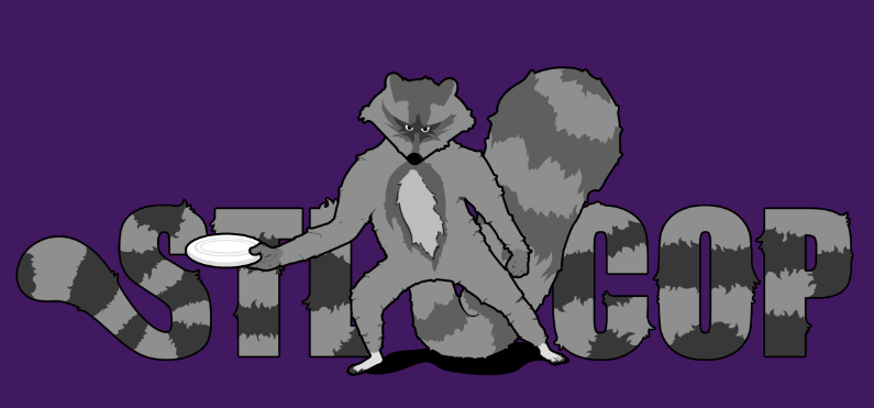
I'm making a Jersey for my friends ultimate team, here's what I have so far;
things left to do:
-remake font with lighter second shade
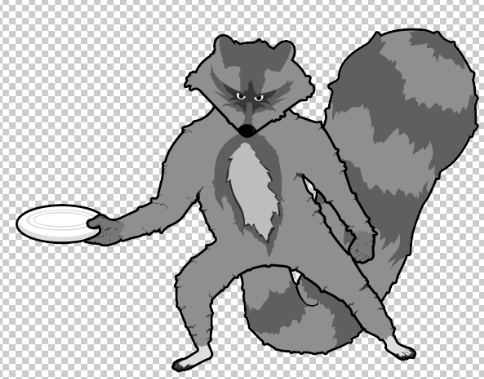
-fix right side of head
-fix flat part of tail, mebbeh
Photoshop CS5 was the only program used, comments/criticisms welcome.
Jersey Front
things left to do:
-remake font with lighter second shade
-fix right side of head
-fix flat part of tail, mebbeh
Photoshop CS5 was the only program used, comments/criticisms welcome.
Last edited by DrunkenMonkey; Jan 27, 2014 at 10:39 PM.
Monkey yeknoM
onkeyM Myekno
nkeyMo oMyekn
keyMon noMyek
eyMonk knoMye
yMonke eknoMy
Monkey yeknoM
Haha, didn't notice that it was longer until now. Well it's free artwork so I cba to fix it.
Yeah STLCOP for Stl College of Pharmaceuticals
Monkey yeknoM
onkeyM Myekno
nkeyMo oMyekn
keyMon noMyek
eyMonk knoMye
yMonke eknoMy
Monkey yeknoM
You should make the font more visible.
Place the racoon a little bit more to the "cop" and move the "stl" a little bit to the left to make the L more visible.
Maybe even put Stl College in a tight font underneath it as well, for the sake of readability.
I won't CnC the racoon as it's too much work for you to fix it.
Only maybe the fact that the stripes from the racoon and text don't match bother me.
Since it's a jersey an extra colour would be shitty to print.
Fr3styL . Improving by Improvising
I'm an artist.
I'm an artist.


