HTOTM: FUSION
Original Post
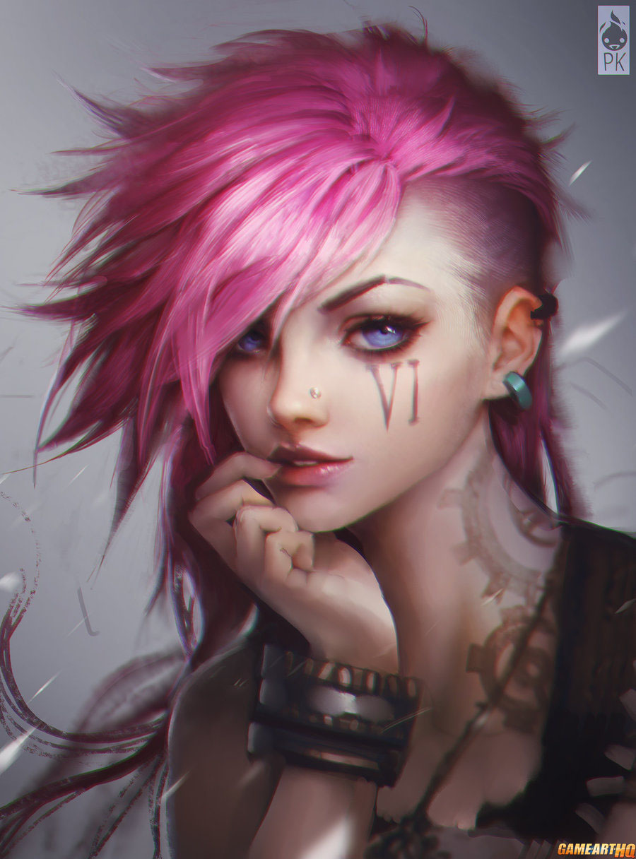
[art] Vi - LOL


Program: paint tool sai/photoshop
About 5 hours

Tips and comments please!
Added a retarded filter at the very end, hence the noisy look.
Last edited by Pheature; Apr 25, 2015 at 07:04 PM.
The detail level is really awesome, the lightning scheme that you made makes it look 100% professional, the only thing I didn't like that much was the facial structure, in my opinion it doesn't make justice to the rest of the piece. I loved what you did to the upper hand, besides the head she looks really strong. The filter is well placed too, gave it a even more realistic look (even tho some parts still look like sketches).

9.9/10
My main concern is about the shape itself, the VI I have in mind should look like Samus Aaran or P!nk, I think those two references do good justice to VI's overview, I did some research and found three distinct head shapes that paint exactly what I meant. Of course you'd have to change things since your paint style is distinct from those, but I'm assuming you got what I tried to say.

i was going to talk about the head shape, but yenno

"vi" on her face should be written AS vi, not "iv" looking at the actual splashart ingame

i really hate the position shes in too, i can hardly tell which hand the top one is. her shoulder seems to be on her back

the coloring is fantastic, the lineart/sketch itself is the problem with this
Originally Posted by Kaneki333 View Post
I'm Brazilian, i'm alredy fucked every day i wake up

That looks amazing, there's something in the face that looks a bit weird for me too, but the rest is really well done.

I was wondering, why do you use Paint Tool Sai for coloring instead of Photoshop?

Parkour • Spar • Skating